Using Excel to Visualize Early Childhood Data
Visualizing your data can help you identify and communicate issues that are important to your community, especially in times of a crisis such as the pandemic.

In fact, transforming spreadsheets into charts, maps, and infographics can be one of the most powerful strategies you can use to help make decisions when time is short and prioritizing is critical.
Yet people sometimes feel that visualizations are difficult or time-consuming to make and/or that they require specialized software and tools or data expertise. However, the truth is anyone can make a data visualization in a short time using tools freely available online or on their computer.
While there are many free online tools for making charts, maps, and infographics, the instructions below are for making visualizations using Microsoft Excel, a common (and often preinstalled) tool available with the Microsoft Office 365 bundle. An added advantage to using Excel is that much of the data you can find on IECAM can be downloaded as an Excel spreadsheet, so you can get to work right away.
For example, let’s say you want to create a chart such as the one on the right showing the change over time of the number of children age 5 and under living in families with incomes below 100% of the federal poverty level (FPL) in a particular municipality (or other geographic area of your choice). This is one way you could do it. *Note that IECAM generally offers ACS 5-year data. However, 1-year data may potentially be useful if your area has experienced rapid changes. A guide for using ACS data is available on the Census website or right here on IECAM.
Three steps
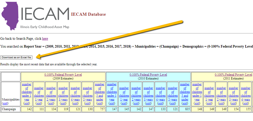
Step One: Download your data from IECAM’s online database.
These instructions will be for working with poverty data. However, similar charts can be made for a wide variety of demographic characteristics.
- Under Year check “Search data across multiple years.”
- Under Early Childhood Service Types & Demographics scroll down and check the "0-100% Federal Poverty Level" button under the “Population, by income-to-poverty rations and age (0-5)” heading. You can check a different income-to-poverty ratio if you want.
- Under Region check the “Municipality” box (or desired area) along with the city desired
- Under Year check all the boxes from 2010 to 2019 (or your desired range). Note that 2019 is the latest year available from the Census.
- Click the submit button and then download this information as an Excel file. If you get a security message, click “download it anyway.”
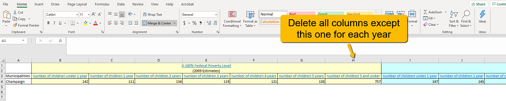
Step Two: Format your spreadsheet
- First, be sure to click on the “Enable Editing” button on the top yellow ribbon of the spreadsheet. This will allow you to make changes to prepare the data and add a chart to the spreadsheet.
- Now save this spreadsheet for future reference.
- Next, we will be deleting columns to focus on all children age 5 and under (and not a specific year of age).
- Delete all columns except “number of children 5 and under” for each year. An easy way to do this is to click on the letter of the column, and then right-click and choose delete. Or you can click and drag to delete multiple columns at once, keeping the cursor just above the selection (and using right-click to delete). You may also choose to copy the columns or numbers for this age group onto a new Excel spreadsheet.
- Now, we will be deleting rows (not columns)to simplify your final chart’s appearance.
- Remove the first three rows by clicking on the number one and dragging to include the second and third row as well. Right-click delete.
- Add an empty row by clicking on the number 1 and then choosing the “Insert cells” icon > “Insert sheet row” from the top ribbon. A row should now appear at the top of the spreadsheet.
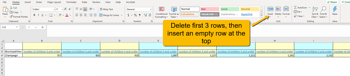
- Now, type the year of the data above each column (be sure to check the numbers are correct by cross-checking with the original Excel sheet you saved). For more advanced visualizations, format this row as a date (you do not need to do this for a simple chart). Your final spreadsheet should look like this:
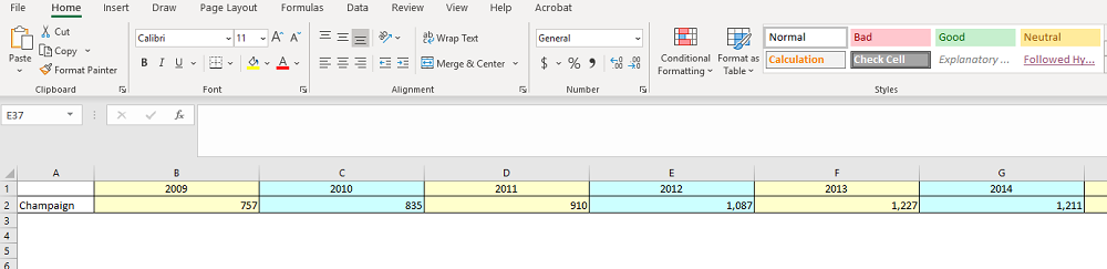
- Be sure to save your spreadsheet. If you are creating a new spreadsheet, it should look similar to the picture above. (Note that the picture above does not capture columns H, I, J, and K.)
Step Three: Create the visualization and refine the details
- Now, highlight your table by clicking and dragging, starting with the empty upper left hand cell. Be sure to only highlight cells in the first two rows, ending with the 2019 column.
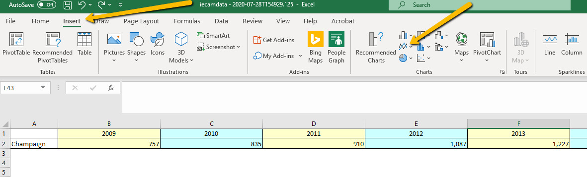
- Click on “insert” on the tool ribbon's upper tabs and click on the line chart icon in the charts section. Choose the first chart on the upper left. This will insert a line chart into your spreadsheet. If you want an even quicker chart, skip this step and when you have your entire spreadsheet highlighted, hold down the ALT and F1 keys at the same time. Excel will automatically insert a chart type for your data configuration (in this case, a bar chart will show up, which you may choose to keep).
- You are now ready to work on the details of the chart.
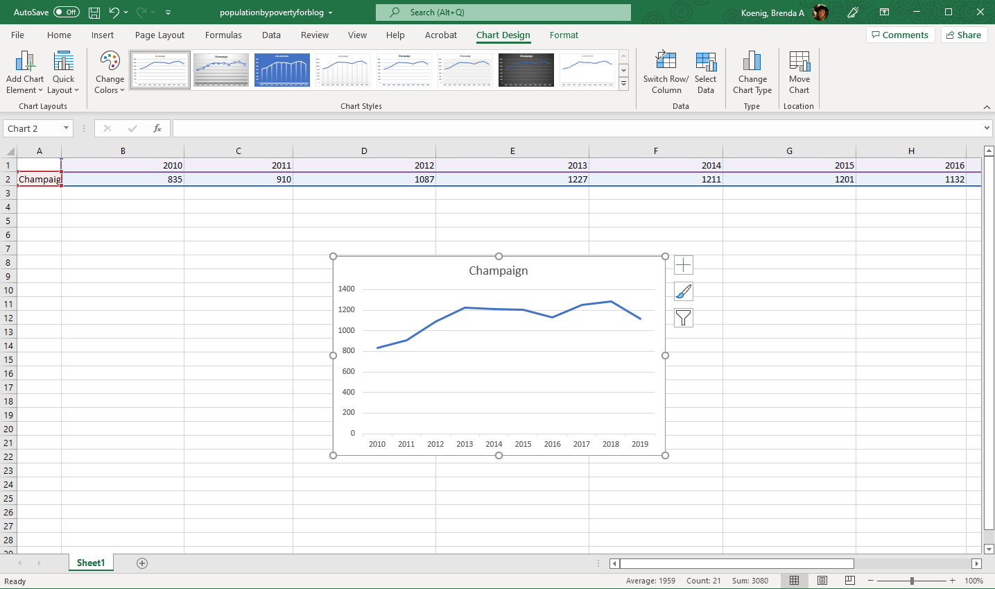
Excel automatically generates this chart from the spreadsheet.
- Double click on the title area to change the title of the chart. “Number of children 5 and under Living in Families w/Income Below 100% FPL in Champaign 2010-19” may not be catchy, but it is accurate! You can click on corners to adjust the size of your text box, and of the chart itself.
- Double click on the numbers along the left hand side of the chart to bring up formatting options. You can do the same with the horizontal axis. Clicking on the chart itself will bring up lots of options, including fill and color options. You can also click on the plus sign next to the chart for labeling, legend, grid lines, and more. In general, it is a good rule to simplify the elements of a chart to make it easy to read (removing gridlines, extra words/decimal points, etc.).
- Tip: You can click on “Recommended Charts” on the tool ribbon to change the type of chart (say, from a line chart to a bar graph), or if you double click on the chart itself, you can choose different designs from the tool ribbon.
- Right click to copy to Word, PowerPoint, Publisher, or more, then save. If you save a copy of the spreadsheet, the chart will be saved as well.
- Final note: Don’t forget to cite your data source, either on the chart itself, or directly below.

If you have questions about any step in this process, do not hesitate to contact us at iecam@illinois.edu. Happy visualizing!